CompTIA: Web UI
Design: Emily Grobe
Art Direction: Andy Sauder
Account Lead: Kyleigh Karas
CompTIA is an organization that conducts certifications, training, testing, education and more in the tech space, making themselves a resource for potential tech-industry job seekers.
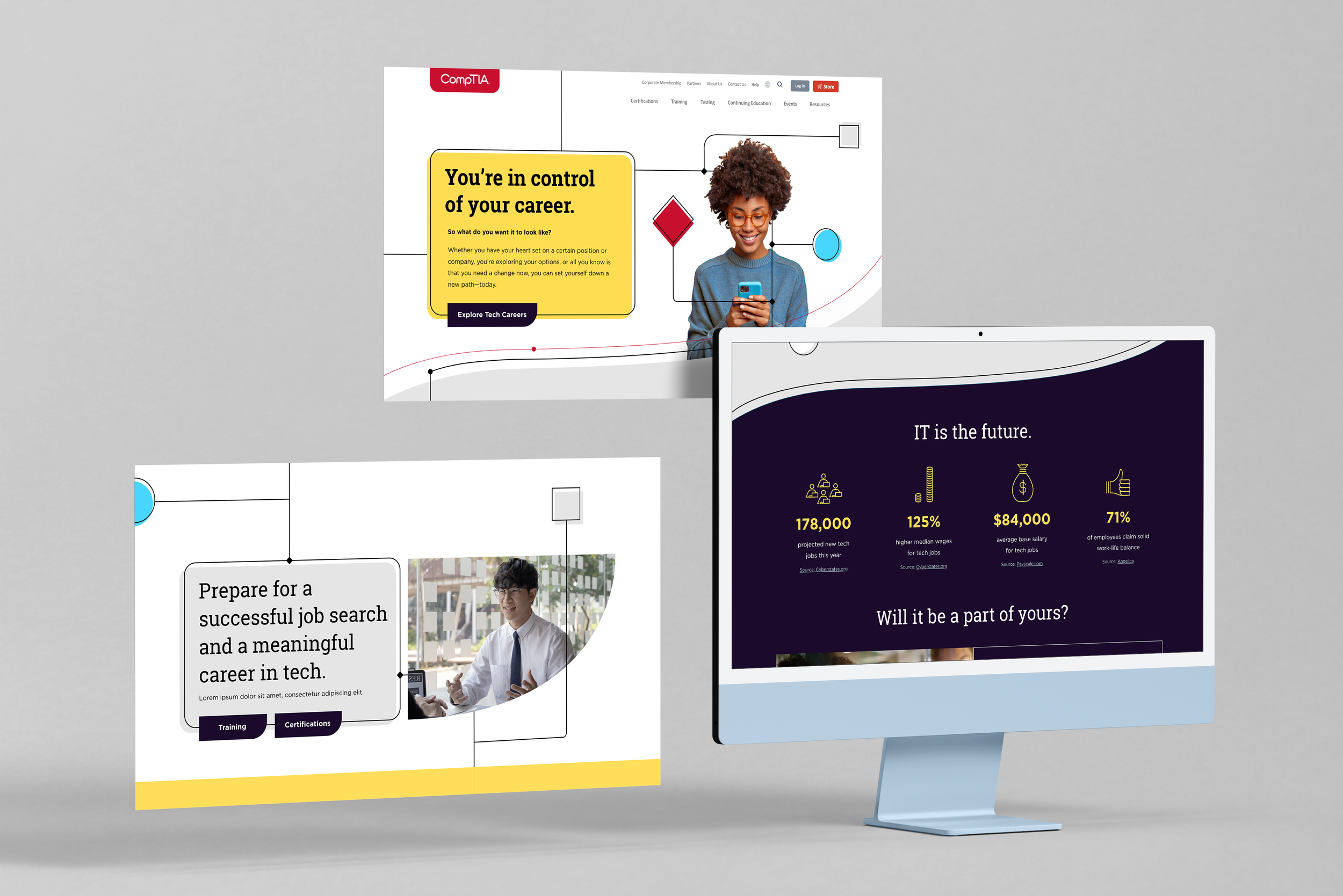
For this project, they wanted an out of the box landing page experience to entice a more diverse audience into their services and into the tech field. The project consists of a “home” landing page and one “interior” page.

Home Page
Working with the client, we devised a strategy to make entry into a tech field more fun and friendly.
I developed a visual language around the idea of “building blocks” and “pathways.”
Building blocks: basic shapes, primary colors – meant to convey the idea that it is not as complicated as you may assume to get a job in tech.
Pathways: flowing lines that mimic circuitry and give computer / technology vibes while guiding users through the content on the page.

Interior Page
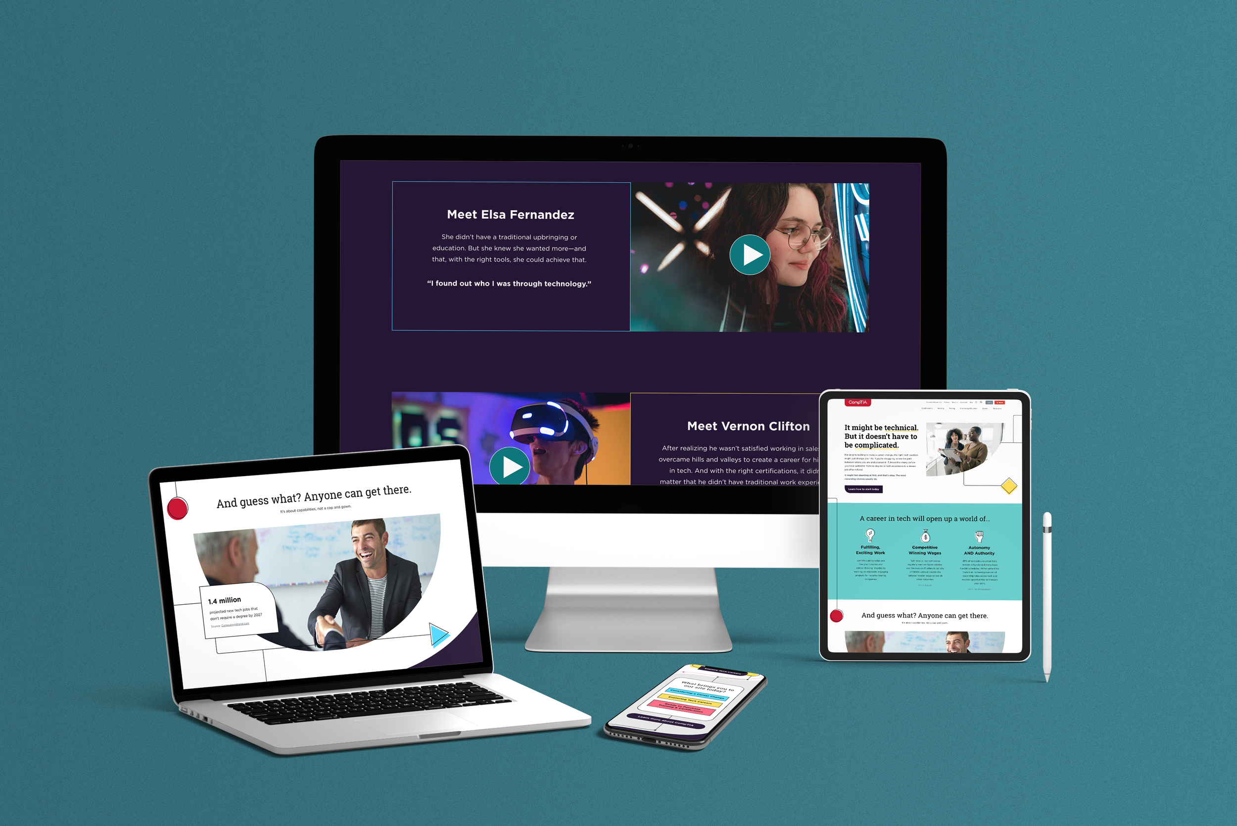
I continue the graphic style from the Home landing page onto this interior page, which has a more focused message specifically to “non-traditional” or hesitant job seekers.
This page is where a user would be brought after clicking the “Considering a Career Change” button on the Home page.
Final Thoughts
Due to timing and budget concerns, these pages were never published to the world wide web. It was one of the first web projects I worked on where I was given creative freedom from the client to push their boundaries, and I wish I could have seen how these pages would have performed.


