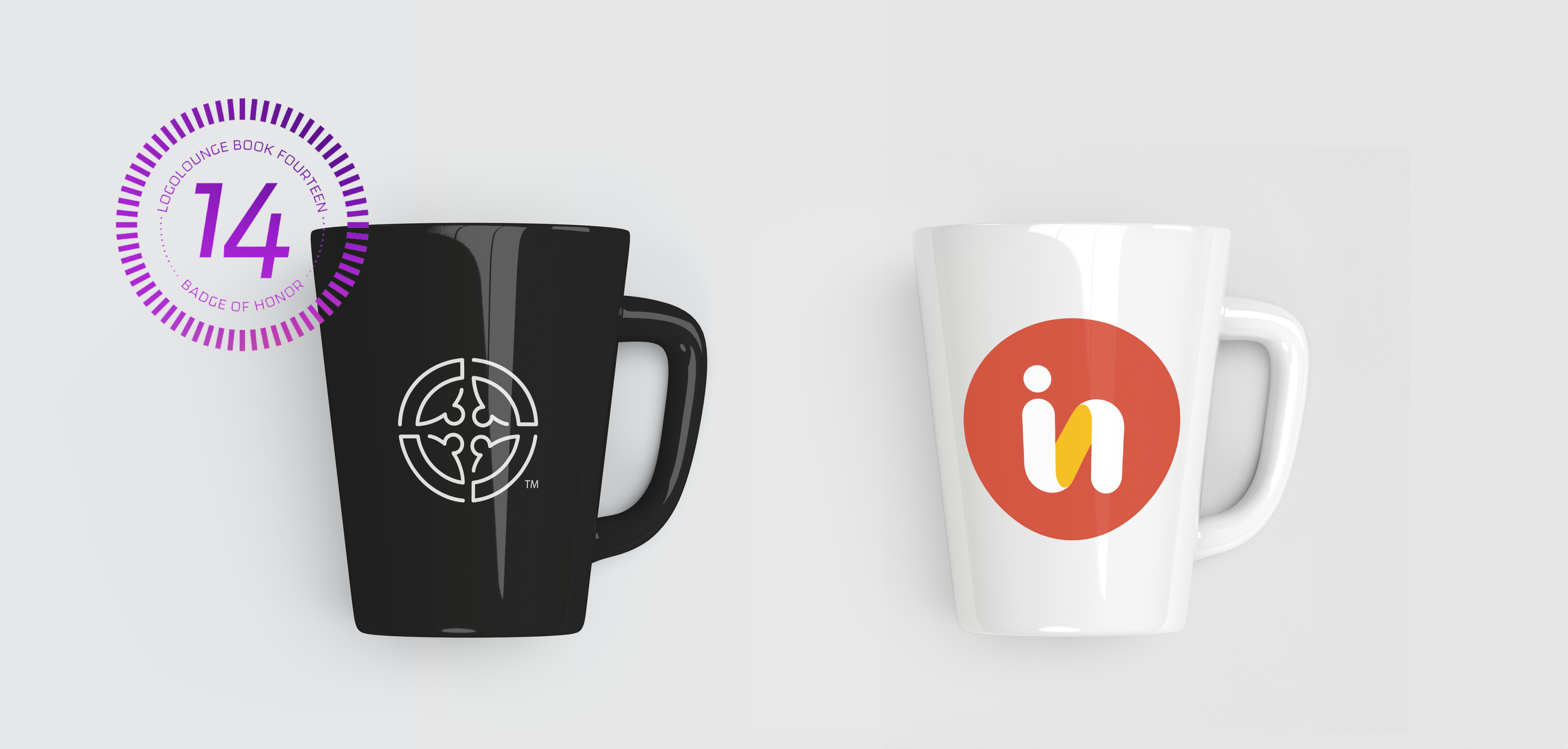
InFolk: LogoLounge Book 14 Winner
Design: Emily Grobe
Art Direction: Susan Herda
Account Lead: Ali Dorn
InFolk provides tools for businesses that help them build the team and culture they want.
This project produced a LogoLounge Book 14 winning logo… but it’s not the one chosen by the client. Isn’t that funny? Here’s the journey to their current logo, and the winner that got away.

Sketching
The InFolk team’s most important goal was to show a sense of togetherness and team in their logo.
Here’s a peek into my process: I always start with word association. By expanding the language around what the client needs, I am able to increase the library of visuals to be inspired by.
Shown below are the two of the digital options InFolk liked most. Showing logos in black and white first allows for clients to evaluate the form without distraction.

Concept 1:
Team. Pieces of a puzzle, coming together to create a unified whole. This option was intended to communicate a sense of cyclical energy, and the flow that is achieved when the right people are assembled. Reminiscent of a huddle formation, this logo implies a sense of community and strategy that InFolk was looking for.
Concept 2:
The implication of a human form in the mark draws focus to the unique capabilities of the individual. Ultimately every team needs diverse perspectives to achieve greatly, and it is what each person brings to the table that allows the group to succeed and flow. I combined these ideas with the “in” letterforms to create this bold and simple mark.
Final Product
After much deliberation, the InFolk team ultimately thought the rounded, friendly, and bold look of Concept 2 fit them best. With a bright and energetic color palette, this logo is optimistic and ready to help.
Although Concept 1 was not chosen, myself and the Rule29 team were not ready to let it go completely. We submitted it alongside other logos for LogoLounge’s Book 14, and were thrilled to have it included!


